Jardim, Meisner & Susser, P.C.
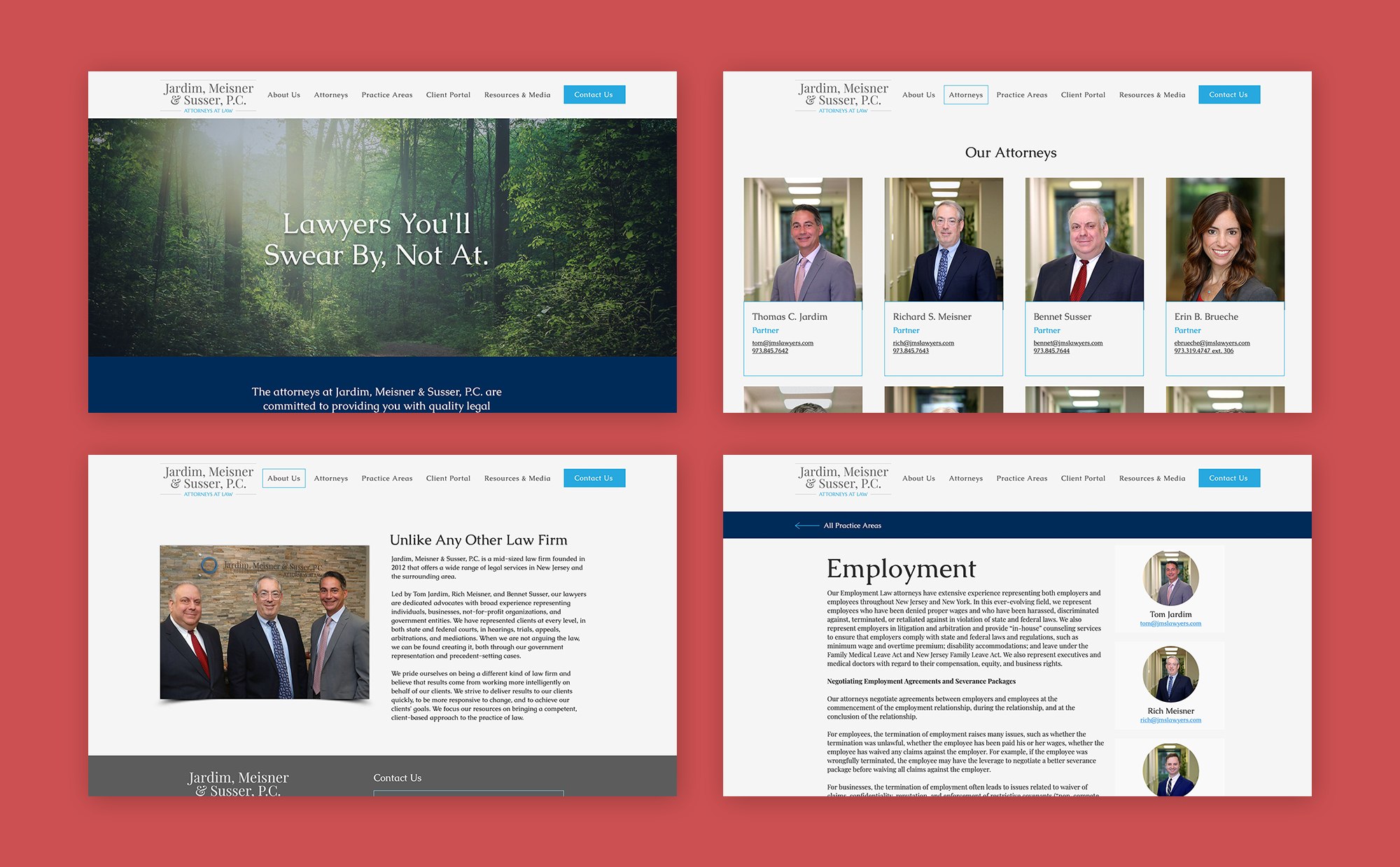
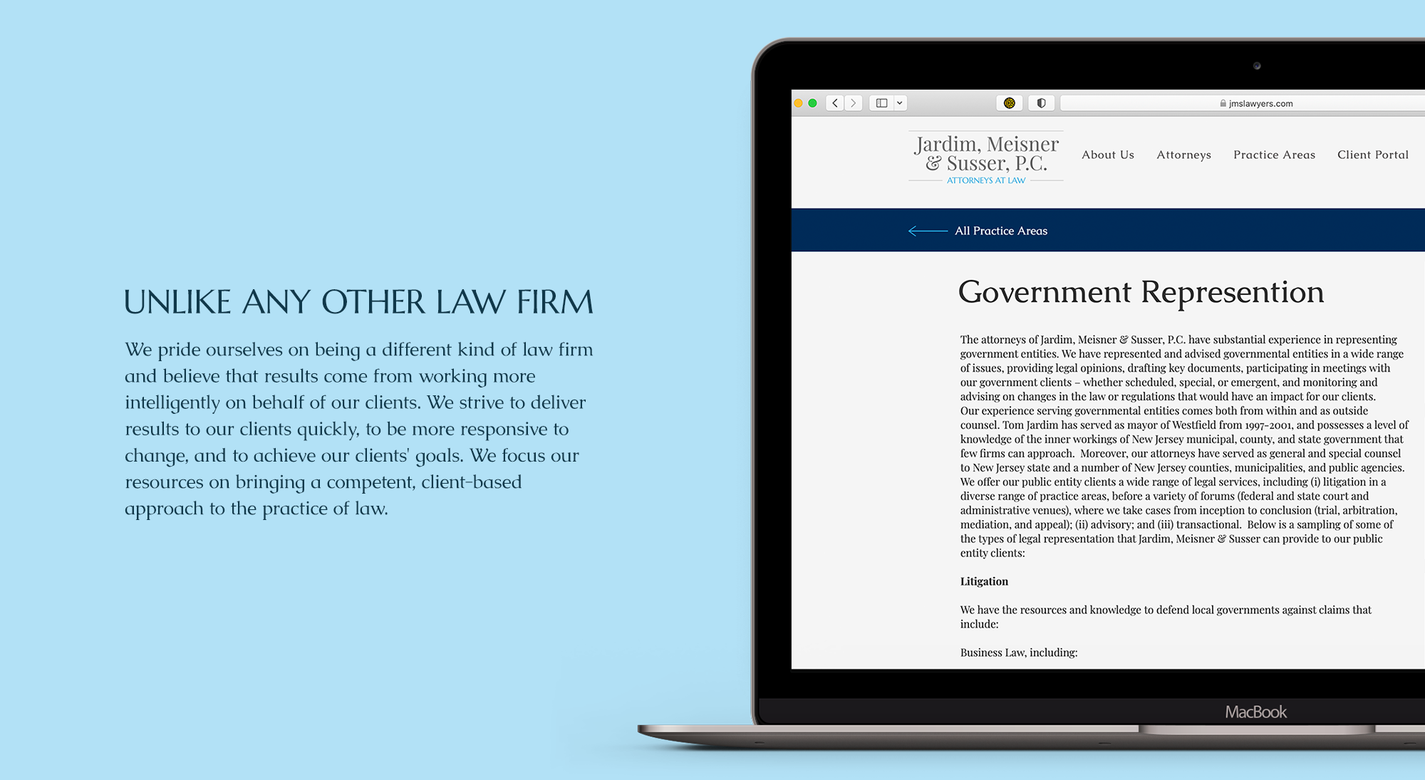
Jardim, Meisner & Susser, P.C. is a mid-sized law firm founded in 2012 that offers a wide range of legal services in New Jersey and the surrounding area. I had the great opportunity to refresh the firm’s logo and redesign their website to reflect a more friendly, down-to-earth aesthetic.
Logo Design + Visual Identity System


An Inflexible Logo
The old logo had several key issues working against it. For one, the circle icon mark that sat prominently beside the firm name was a meaningless shape that didn’t connect to the brand positioning or purpose. The multiple shades of blue represented within the circle mark, and the additional shade of blue used in the words “Attorneys At Law,” were difficult to print consistently. Finally, the long horizontal logo worked well only at a large enough scale to be legible; when viewed on a mobile device or on a small business card, the logo wasn’t having the impact that the firm wished.
A Greater Impact
We worked with the existing typography to create a new logo lockup that makes a greater visual impact. We removed the meaningless circle icon, instead focusing on amplifying the name of the firm and creating a more balanced, centered alignment of the type. This new logo is not drastically different from the old logo, however the subtle shift in hierarchy and the simplified color palette creates a much more flexible and impactful logo for the firm to use across all platforms.

Illustrations by MacroVector